Apparently, I’m a year or two late to this, but HOLY SHIT, did you know Nicholas Felton designed some wine labels! How did I miss this?
Nicholas Felton is a star in the world of data visualization. His Feltron Reports (each a data-driven record of his year, done in the style of a corporate annual report) are legendary. He also cofounded Daytum and inspired the Facebook Timeline. As a data geek, both professionally and personally, I love his stuff. Which is why I can’t believe I never heard of this. If there are two things that always catch my eye on Twitter, it’s talk of data visualization/infographics and wine labels.
Alright, enough of my dismay over missing this news. Let’s take a look at the labels. They were done for Between Five Bells, a small winery in Victoria, Australia. You can read their story of the labels here. There are two general label styles: one style is focused on the vinification data and the other style is focused on the growing season or vintage data. Let’s start with the first.
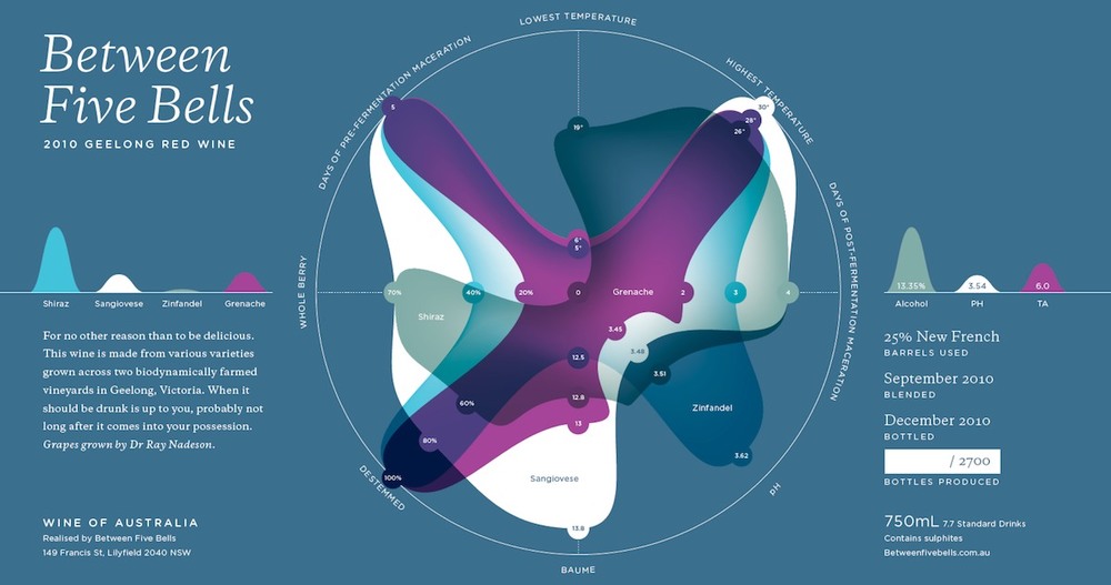
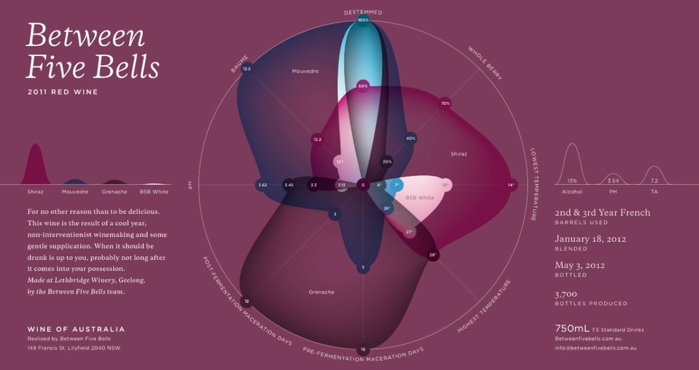
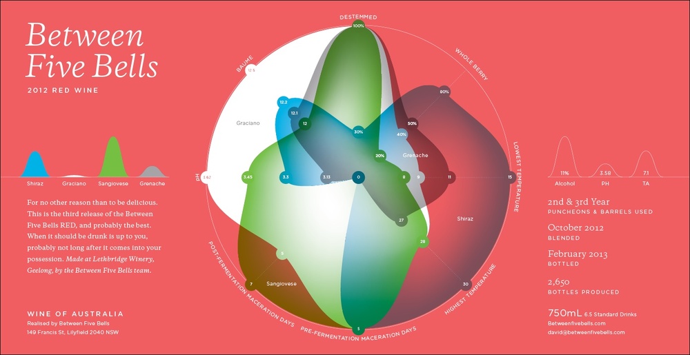
The main visual on each of these labels shows eight key data points for each grape variety in the blend: from baume and pH to whole cluster and de-stemmed percentages to maceration days and fermentation temperatures. That’s a lot of data and it makes for a unique and cool signature of each wine, almost like a thumbprint.
Two quibbles. 1) In the little chart on the left that presumably shows the proportions of each grape variety in the final blend, why not include the actual percentage values? The data labels are shown for every other data point on the label and the average wine drinker cares way more about this information than all the rest. 2) As a Mourvèdre evangelist, I cringe a bit at the spelling “Mouvedre” on the 2011 label.
But very cool labels, indeed.
•••
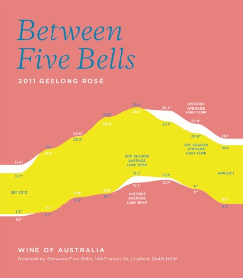
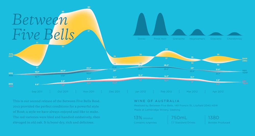
Next up are the Rosé labels, which focus on the growing season data.
The Rosé labels take a different approach. I wonder if it was driven by the difficulty of employing the other style with seven grape varieties instead of just four. These two are more different from each other than labels in the other style are, so let’s take them one at a time.
The front label of the 2011 shows the historic average high and low temperatures across the growing season (September to April) — that’s the white band. The yellow band overlays the average high and low temperatures for the 2011 vintage. You can see at a glance that this vintage was a cool one, especially in the last several months of the growing season. The back label (not shown here) displays the rainfall vs. the historic average in a similar fashion.
With the 2012 label, they decided to “stack” these charts, which makes some sense given that they are on the same time scale. Also the high and low values are not shown as a band; rather, each is is plotted as a ribbon, with the deviation (positive or negative) from the average filled in. I find the 2012 more confusing than the 2011. To my eyes & brain, it’s harder to tell from a quick look at the high and low temperature ribbons when they are above or below the historic average. This is easier on the rainfall ribbon, which is very cool and has the unique signature effect.
I really love the 2011 Rosé label. Even beyond the data, I think it works really well as a wine label. Because it’s trying to do less, it’s cleaner and there are fewer axis labels and such, which makes it possible to see it as label art first and chart second. Also, bonus points for it fitting on a single front label, not a wraparound label. As a blogger who frequently photographs labels for posts or Instagram, wraparound labels are a pain in the neck. I also love that it speaks to the wine’s place more than the winemaking style. Now if they could just add those grape variety percentages and maybe add soil composition, vine age…
•••
You may be wondering, what finally tipped me off to this. Instagram, of all things. I saw a photo from @hawk_wakawaka that mentioned this winery. Intrigued by the unusual blend she mentioned (cool-climate Shiraz, Sangiovese, Grenache and Zinfandel in Australia), I googled them only to have my day made by their labels. Better late than never.